Mobile Ordering
Empower your customers with the ability to order easily even while on the go.
Mobile Menu Layout
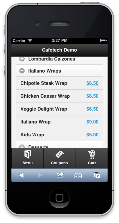
Your menu is automatically formatted for all of your mobile customers without the need to adjust anything. At any time they can choose to 'view full site' if they would prefer.
Instead of showing multiple columns, there is only one column. Menu categories are shown in a collapsible list, which saves mobile screen space. Only one category will be displayed at any given time.
There are large, easy to tap navigation buttons on the bottom side of the screen. These serve as an easy way to click through to your menu, coupons or show the shoping cart.
Mobile Coupons
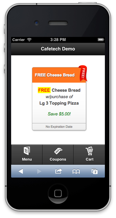
Mobile coupons are displayed in the same way that regular coupons are. The only exception is that they're shown in a vertical column instead of horizontal.
Your customer can simply tap on the coupon to add the offer to the shopping cart.
The intention is that your customers are able to use these coupons directly from your website. You could choose to accept the coupon via a walk in order if a customer shows you the coupon on a mobile device. It's your choice.
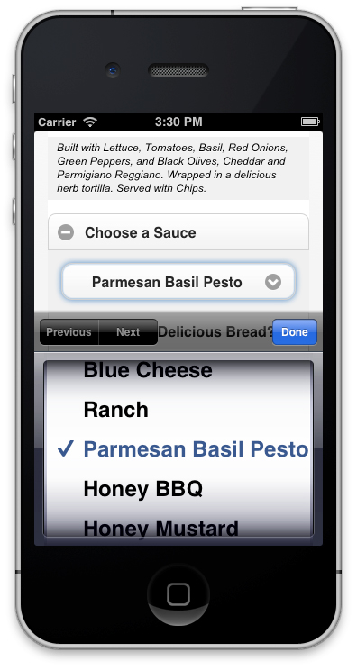
Mobile Item Options
Choosing options on a mobile device is slightly different than our usual interface. Options have been re-formatted to be bigger, and easier to read on a smaller screen.
These options are automatically adjusted without the need to change anything on your end.
